
The typical working-age American earns about $41,400 each year. In most parts of the world, an income at that level would guarantee an extraordinarily high standard of living. Yet few Americans move to Lagos or Mumbai—or even Palermo—despite the apparent gains to be made.
The reason, of course, is that the typical American cannot earn anything close to the typical U.S. income in those places. Differences in language and culture mean the typical American would be lucky to earn the typical local wage in many cities that appear “affordable” according to their cost of living.
For some reason, many Americans fail to take this perspective when looking at where to live within their own country. They complain about “declining affordability” in places where rents and house prices are rising rapidly, but ignore the state of the local economy. This leads to common misconceptions, such as the belief that sprawling metro areas such as Dallas and Tampa, Fla., have become more affordable in the past few years relative to the San Francisco Bay Area, which notoriously limits construction. Counterintuitively, data show the Bay Area, along with Cincinnati and Cleveland, has done the best job of keeping living costs in line with worker pay among major metro areas.
The Bureau of Labor Statistics has long-term data on local housing costs in 25 major metro areas, which it tracks as part of its calculation of the consumer-price index. The BLS measures the price of shelter by asking renters how much they pay and by asking homeowners how much they think they could charge renters to live in their property. “Owners’ equivalent rent” doesn’t track what most Americans actually spend on housing, but it does track how living costs have changed over time.
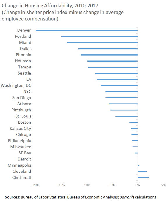
According to the BLS, the metro areas with the biggest increases in housing costs from 2010 to 2017 are Portland, Ore.; Denver; the San Francisco Bay Area, and Seattle. Effective rents are up about 35% (about 4% each year) in those regions. At the other end of the spectrum are Philadelphia, Cleveland, Milwaukee, Cincinnati, Chicago, and Kansas City, Mo., where housing costs have increased just 15% over the same period. Atlanta, Phoenix, Houston, and Tampa are in the middle of the overall range, but higher than the U.S. as a whole.
Taking a longer view from before the financial crisis, the biggest housing cost increases between 2000 and 2017 were in Miami, Los Angeles, and San Diego (about 80%) while the smallest increases were in Cleveland, Detroit, Atlanta, and Cincinnati (about 33%). In the middle were Pittsburgh, Denver, and Philadelphia.
These numbers, of course, offer zero information about the change in affordability in each city over these periods, much less the change in relative affordability between cities. That requires comparing changes in average housing costs with changes in average spending power.
The Bureau of Economic Analysis provides estimates of household incomes for every metro area of the U.S. The standard definition of personal income, however, includes the imputed income homeowners “earn” by not having to rent. The biggest source of variation in this “income stream” is the long descent in mortgage interest rates, which is why “rental income of persons” has ballooned from 0.5% of total personal income in 1990 to 1.5% in 2007 to more than 4% since 2014. All this makes the standard income numbers invalid for calculating housing affordability.
Fortunately, the BEA also provides data on average employee pay in each metro area. (I combined the San Francisco and San Jose metro areas because the government’s definition weirdly splits Silicon Valley in half.) Among the metro areas for which the BLS tracks housing costs, the one with the lowest-paying average jobs is Miami, with the average worker earning $46,000 in pay and benefits in 2017, the latest year for which we have data. At the other end of the spectrum, the average worker in the Bay Area earns a little more than $92,000. Across the entire U.S., the typical worker was paid $55,000.
There is almost as much variation in the growth of worker pay over time. Between 2010 and 2017, the average worker in the Bay Area experienced a 34% increase in total compensation, which was the largest increase—by far—among major metro areas. New York, Washington, and Miami experienced the least growth, with average worker pay rising just 10% over the period. Going further back to when the data begin in 2001, average employee compensation has increased the most in the Bay Area (65%) and in Seattle (60%), while increasing the least in Detroit (26%), Miami (29%), and Atlanta (32%).
Things get interesting when comparing changes in worker pay against changes in housing costs. Between 2001 and 2017, the average U.S. worker’s pay rose by 44% in dollar terms. Over the same period, overall housing costs rose by 48%. This gap is a postcrisis phenomenon. Between 2001 and 2007, average employee compensation and average shelter costs both rose by 20%, with no overall change in underlying affordability. Between 2010 and 2017, however, average shelter costs rose by 20%, while average employee compensation rose just 15%. For the country as a whole, housing has become less affordable for the typical worker.
These national averages conceal considerable regional variation. Between 2010 and 2017, average worker pay grew slightly more than average housing costs in Cincinnati and Cleveland. In Minneapolis, Detroit, and the Bay Area, the average employee’s salary and benefits grew at about the same rate as the average housing cost. The price of shelter rose slightly more than average employee income in Milwaukee, Philadelphia, Chicago, Kansas City, and Boston. In all other major metro areas, housing costs grew at least four percentage points more than average worker pay.
The biggest decline in affordability was in Denver, where housing costs grew 20 percentage points more than average employee compensation. Portland wasn’t far behind, with housing costs rising 15 percentage points more than worker pay. Despite experiencing similar rent increases as San Francisco, Denver and Portland became far less affordable for the average worker.
The rankings change slightly when going back to 2001, but not by much. Midwestern cities and San Francisco have all improved housing affordability for workers, while Miami, Los Angeles, and New York have seen massive declines in affordability.
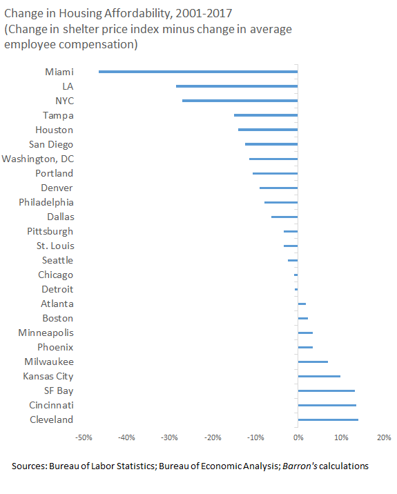
Miami’s exceptionally poor performance can likely be explained by its appeal as a haven for wealthy American retirees and for foreign investors. If many of the people moving to Miami aren’t looking for work, the imbalance between incomes and housing costs may never need to be resolved. New York and Los Angeles do not have this excuse. Houston, despite building too much housing in flood-prone areas, seems to have failed to build enough housing to keep costs down for its workers.
Unfortunately, none of these numbers capture changes in the distribution of income among workers, or changes in the split between workers and retirees. The data make it clear the Bay Area has done an unusually good job of maintaining its housing affordability for the average worker, but many people, especially longtime residents who are doing worse than the average worker, have had a distinctly different experience. Those concerned about falling affordability may therefore want to focus at least as much on income inequality as on the supply of homes.