Call us crazy, but paint is one of our favorite facets of interior design. This unsung hero is the definition of high-impact, low-lift design — you can give your home a brand-new look and feel with a $20 gallon of your chosen hue, a few paint brushes, and a weekend’s worth of effort. It’s perfect in all of its simplicity (and we haven’t even waxed poetic about creative paint applications yet).
This is all to say that we’re beyond excited to present our 2023 paint trend predictions. Crowd sourced via the Havenly interior design team, we believe that the following hues reflect our current cultural penchant for comfort, nostalgia, and self-expression. White paint (and cool minimalism) will always have a place in our hearts, but we’re seeing a slow but steady shift towards all things bold in the design world, paint included.
Ahead, find the trending 2023 paint colors we’re swatching on our walls into the new year, plus our favorite brand selects.
We’ve said it before, and we’ll say it again: brown is back in a big way across fashion and interior design. And while this color trend felt a bit niche a few years back, it’s officially hit the mainstream with shades of mink, mocha, mushroom, taupe, and beyond saturating retailers like CB2 and Zara. We’ll always love a little high-contrast black against crisp white, but for now, we’re experimenting with hints of down-to-earth brown in both our wardrobes and homes.
Deep Chocolate Brown
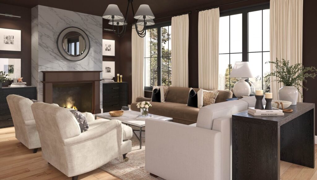
First things first: this rich, black-brown hue that’s beautifully complex and storied. Whether you go for it on all four walls (kudos) or bring in the hue via dark wood furniture and decor, this full-bodied color is surging in popularity. Swatch it in your home with Benjamin Moore’s Midsummer Night, Farrow & Ball’s Tanners Brown, and Sherwin Williams’ Manor House.
Muddled Taupe

With hints of gray and green, this muddled mink hue is a beautiful taupe that we basically want to use in every room. It’s rich, earthy, and saturated, but still neutral. Test the waters in your space with our favorites: Benjamin Moore’s Equestrian Gray, Farrow & Ball’s Charleston Gray, Sherwin Williams’ Studio Clay.
Hot Chocolate Brown

This color that definitely leans into the violet undertones. As a result, it feels rich and deep, yet soothing and complex — almost like a cup of steaming hot chocolate. Add to your space with Benjamin Moore’s Topeka Taupe or Sherwin Williams’ Brows Brown.
If 1970s marble, all brass everything, and Emma Chamberlain’s home weren’t any indication, retro design is back, and we only see this trend gaining steam in 2023. The following retro paint colors speak to that overarching theme, including punchy olive green, nostalgic marigold, and rich copper.
Cinnamon Spice
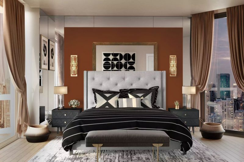
This rich, rusty hue was commonplace in the late 1960s and 1970s, and the high-impact hue feels equally at home in 2023. From deep brick to vibrant terracotta, we love all shades of this paint color, particularly Benjamin Moore’s Cinnamon, Farrow & Ball’s Picture Gallery Red, and Sherwin Williams’ Spicy Hue.
Punchy Marigold
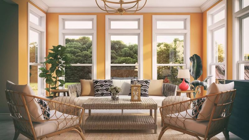
Marigold, ochre, and muted mustard are also at the top of our retro paint colors list. We see this color singing in a small powder room, sunny guest room, or retro office space, particularly paired with vintage furniture. We recommend adding Benjamin Moore’s Mayan Gold, Farrow & Ball’s India Yellow, and Sherwin Williams’ Alchemy to your paint sample list.
1970s Olive

With bold yellow undertones, retro olive green feels perfectly suited to 2023 (we’re over you for now, sage). Bonus: it looks flawless with shades of brown and warm brass, too. We strongly advise leaving Home Depot with a sample of Benjamin Moore’s Home on the Range, Farrow & Ball’s Bancha, and Sherwin Williams’ Tansy Green.
In our humble opinion, blue paint is as timeless as it gets. This year, we’re predicting a flair for classic, historical blues like rich navy, soft sky, and dreamy Cornwall blues. We’ll always have a thing for cobalt or our time-honored favorite, Hale Navy, but for now, we’re dipping our toe into more traditional waters.
Blue Skies
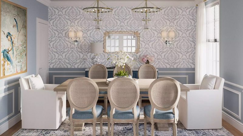
Soft gray-blues have such a classic feel about them, especially when dressed up with wallpaper, wainscoting, and a grand chandelier or two. Our favorites? Easily Benjamin Moore’s Subway Tile, Farrow & Ball’s Parma Gray, and Sherwin Williams’ Krypton.
Bold Navy

There’s nothing we love more than a strong, full-bodied navy blue. This particular shade feels like it belongs on a Bridgerton set, which is precisely why we love it. Channel this historical hue at home with Benjamin Moore’s Washington Blue, Farrow & Ball’s Railings, and Sherwin Williams’ Charcoal Blue.
Cornwall Blue

Closely related to French blue, this color is just as historical, but a notch more nautical. Plus, with slight green undertones, it’s incredibly serene and relaxing. Don’t believe us? Swatch Benjamin Moore’s Bella Blue, Farrow & Ball’s Selvedge, and Sherwin Williams’ Baby Blue Eyes.
